Hello, I am Hee Seo [Hee-Suh] Chun, a communication and visual designer, graduated from Carnegie Mellon University's School of Design Undergraduate program in 2019. In recent history I’ve crafted digital products at AKQA, and I am currently working at Huge Inc as a visual designer.
Projects
> AKQA (NDA!)
> PROJECT MELO
> TYPEMOJI
> PAINT THE PAVEMENT
> A DREAM
> LENS
> GENEROUS FEEDBACK
> LUNAR GALA
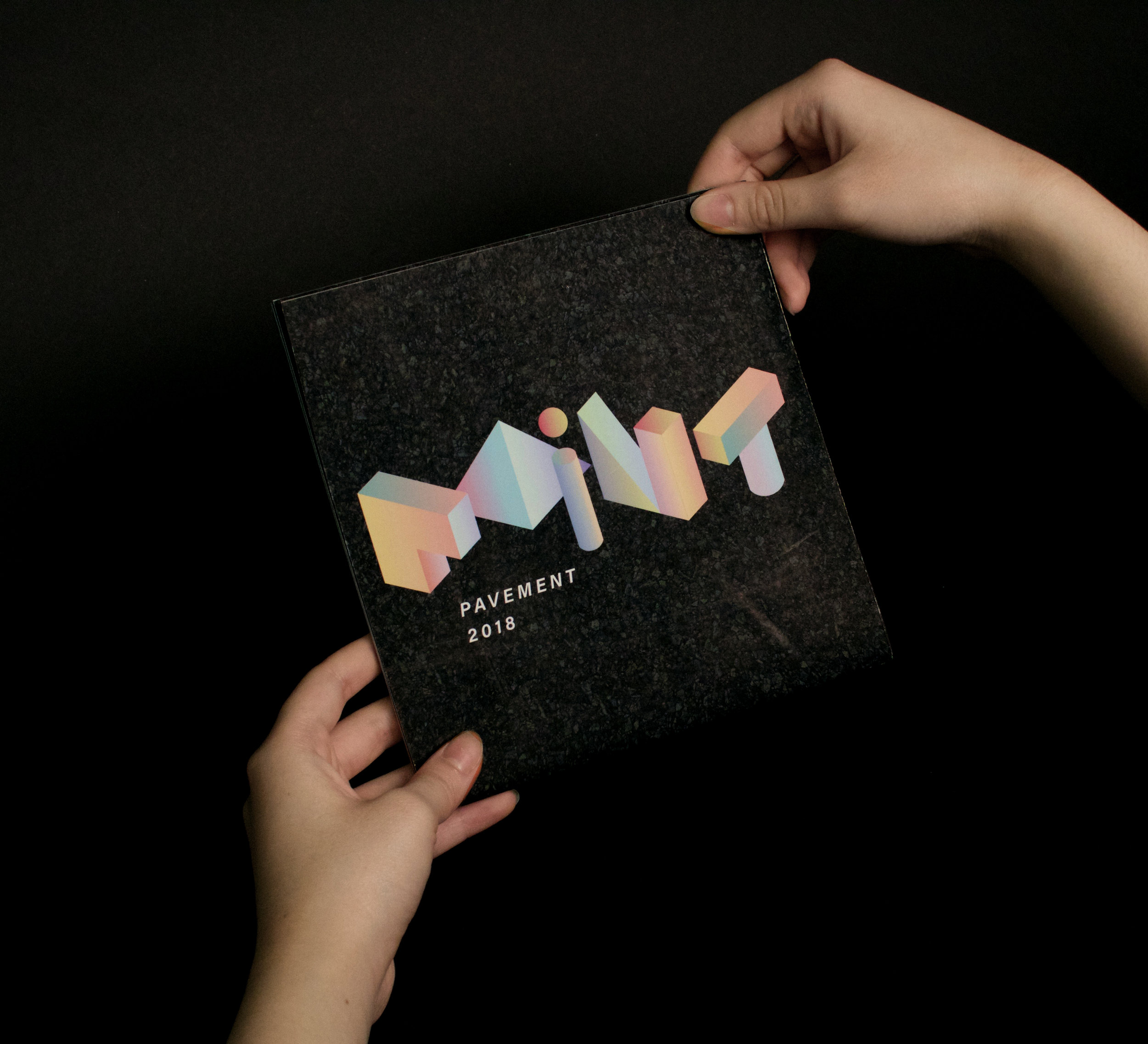
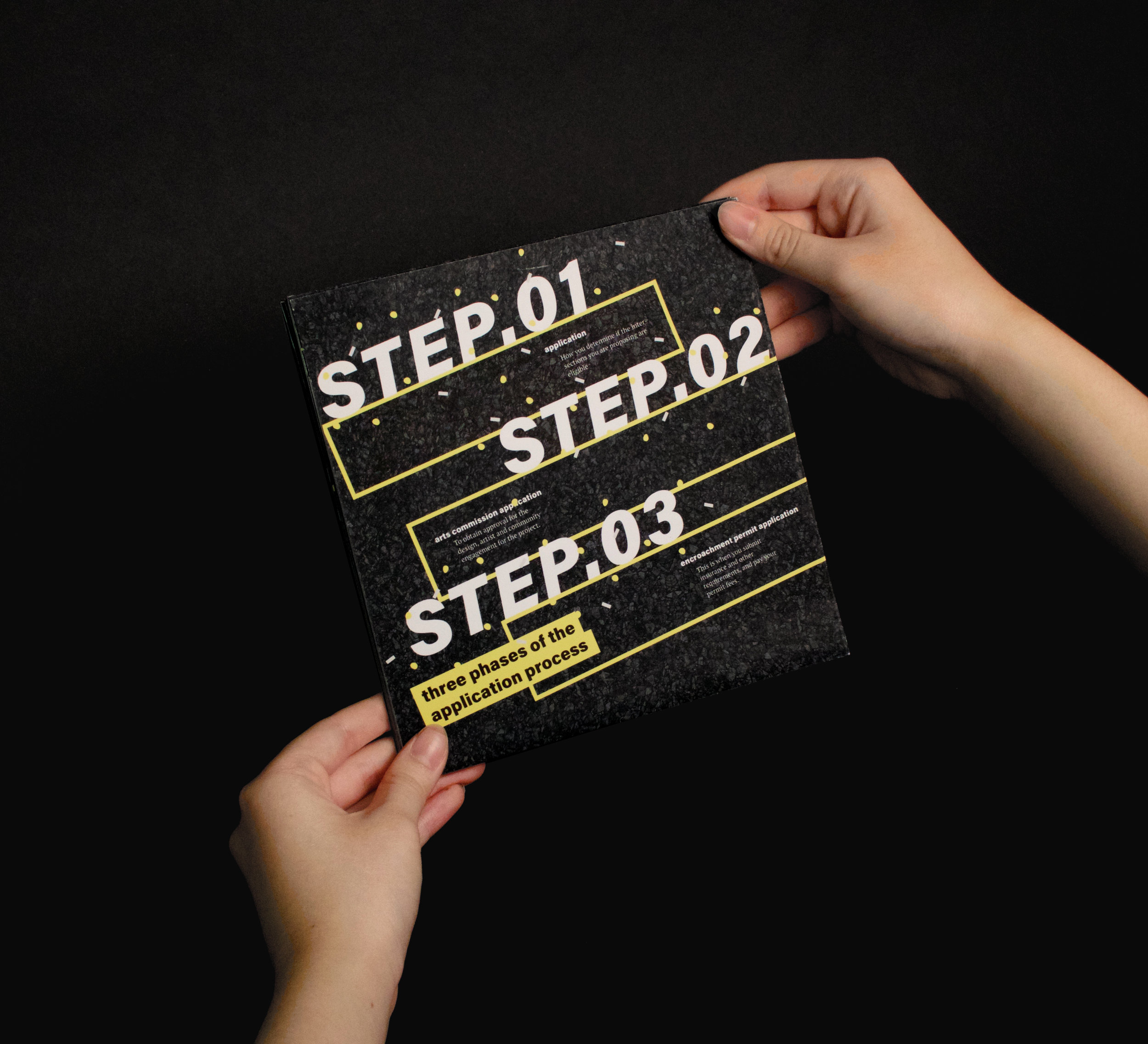
Paint the Pavement is a national program that promotes public safety through the participation of local artists and communities. The practical objective of this program is to paint murals on streets to slow down traffic and transform dangerous roadways into neighborhood assets.
Technique: Brand Identity, Visual System, Print // Design Tools: Illustrator, Photoshop // Duration: 8 weeks // The Ask: Design the visual system including wordmark, poster, to the complete brochure and application form for Paint the Pavement, not using any photographs or pictorial images //

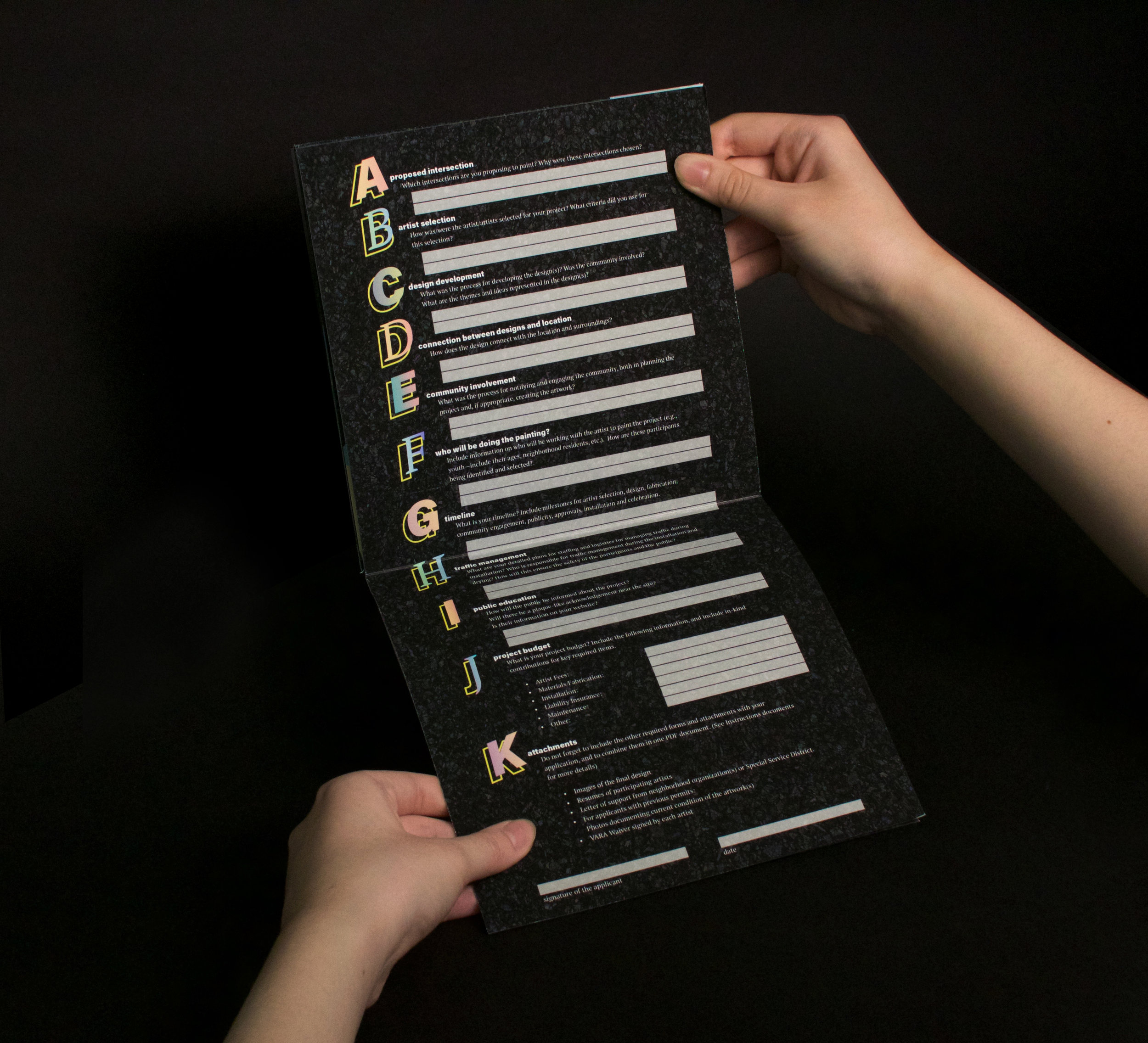
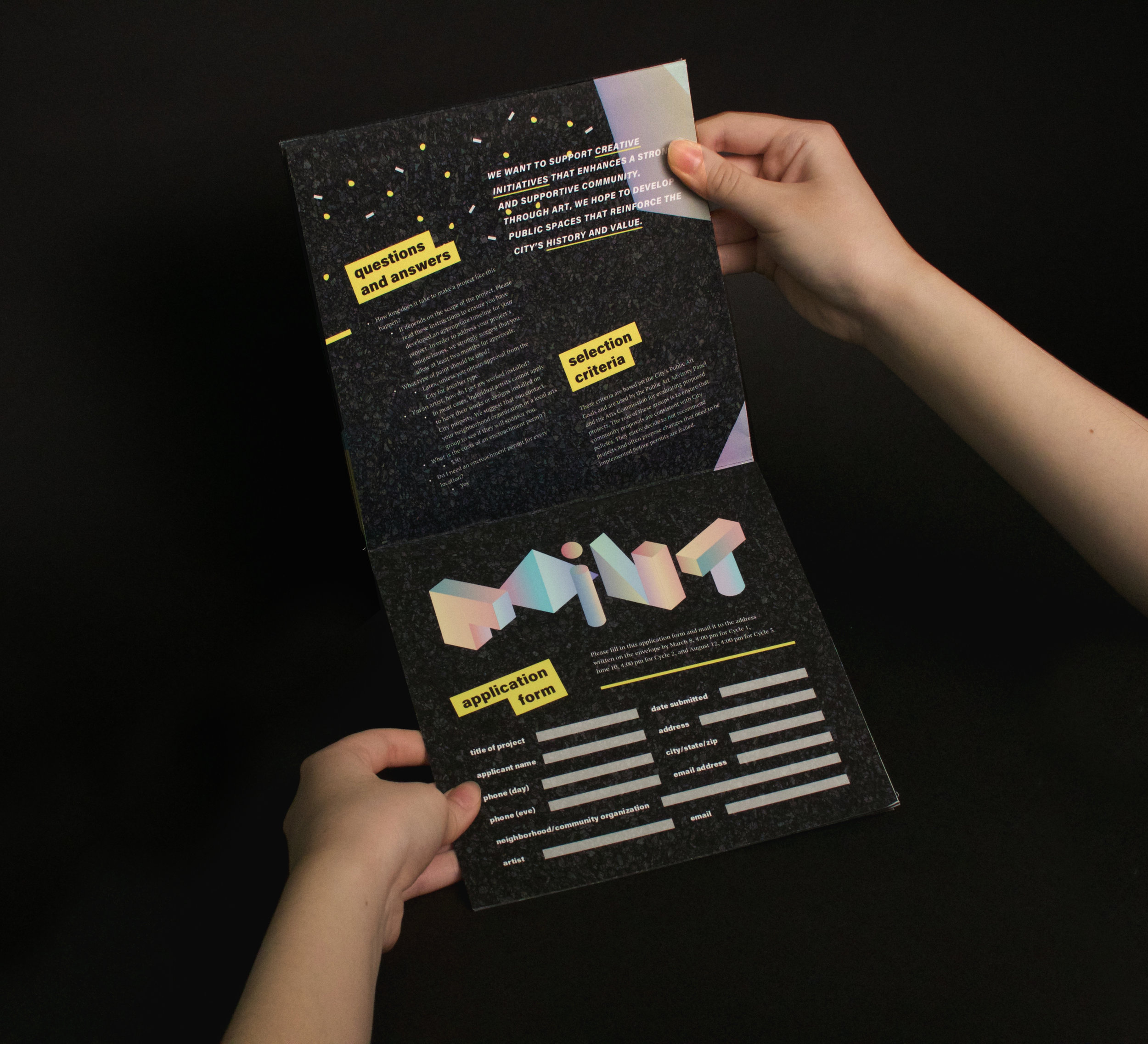
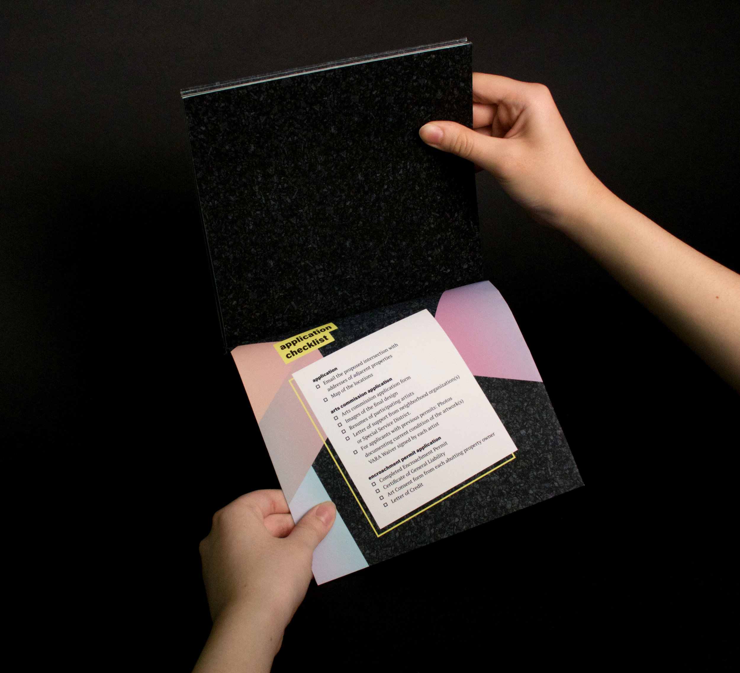
PROCESS
CONCEPT DEVELOPMENT
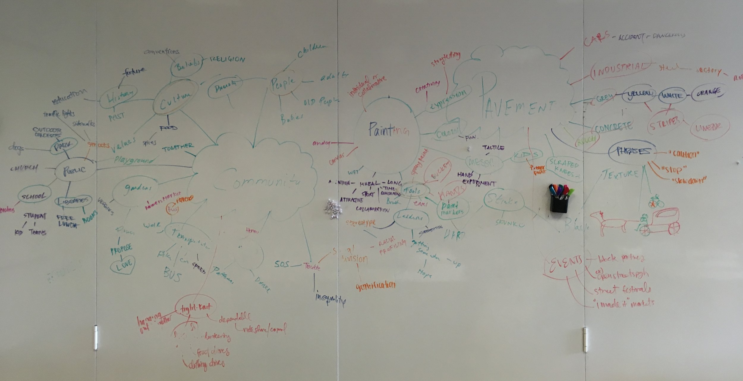
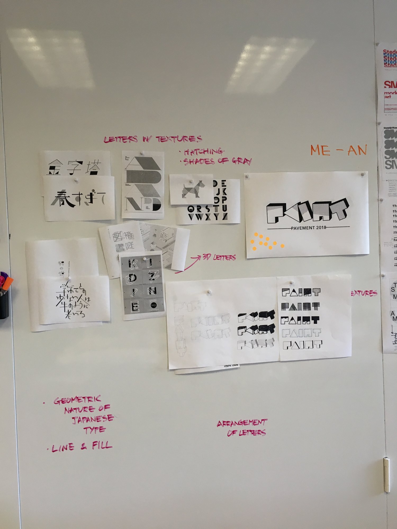
I started off with brainstorming prior to creating a wordmark that would guide the entire brand identity of Paint the Pavement. I set my target audience as teenagers who are interested in painting and want more experience in the field with other people and the professionals. As a class, we mapped out on the whiteboard to look at the things that could possibly be associated with Paint the Pavement, in order to establish a concept true to the program's intention while it is specific to Pittsburgh.
![]()
CONTENT ANALYSIS
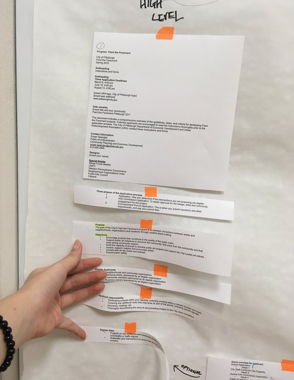
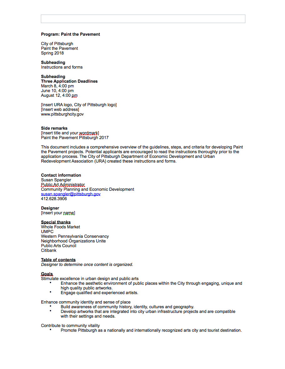
Because what I was initially given was an unedited, unorganized 5-page long document with just text, I was given the freedom to manipulate the wording and the order of the content in a way that made the most sense based on my concept and what I was trying to communicate. With a few of my classmates, I cut out each part of the document and rearranged them on a large sheet of paper based on the category. We categorized them, and experimented with how to put them in order so that readers could easily follow through.
I also changed some parts of the text by condensing them, paraphrasing them, or completely rewriting them in a way that is more appealing and readable for my target audience.
![]()
![]()
I also changed some parts of the text by condensing them, paraphrasing them, or completely rewriting them in a way that is more appealing and readable for my target audience.
VISUAL STYLE
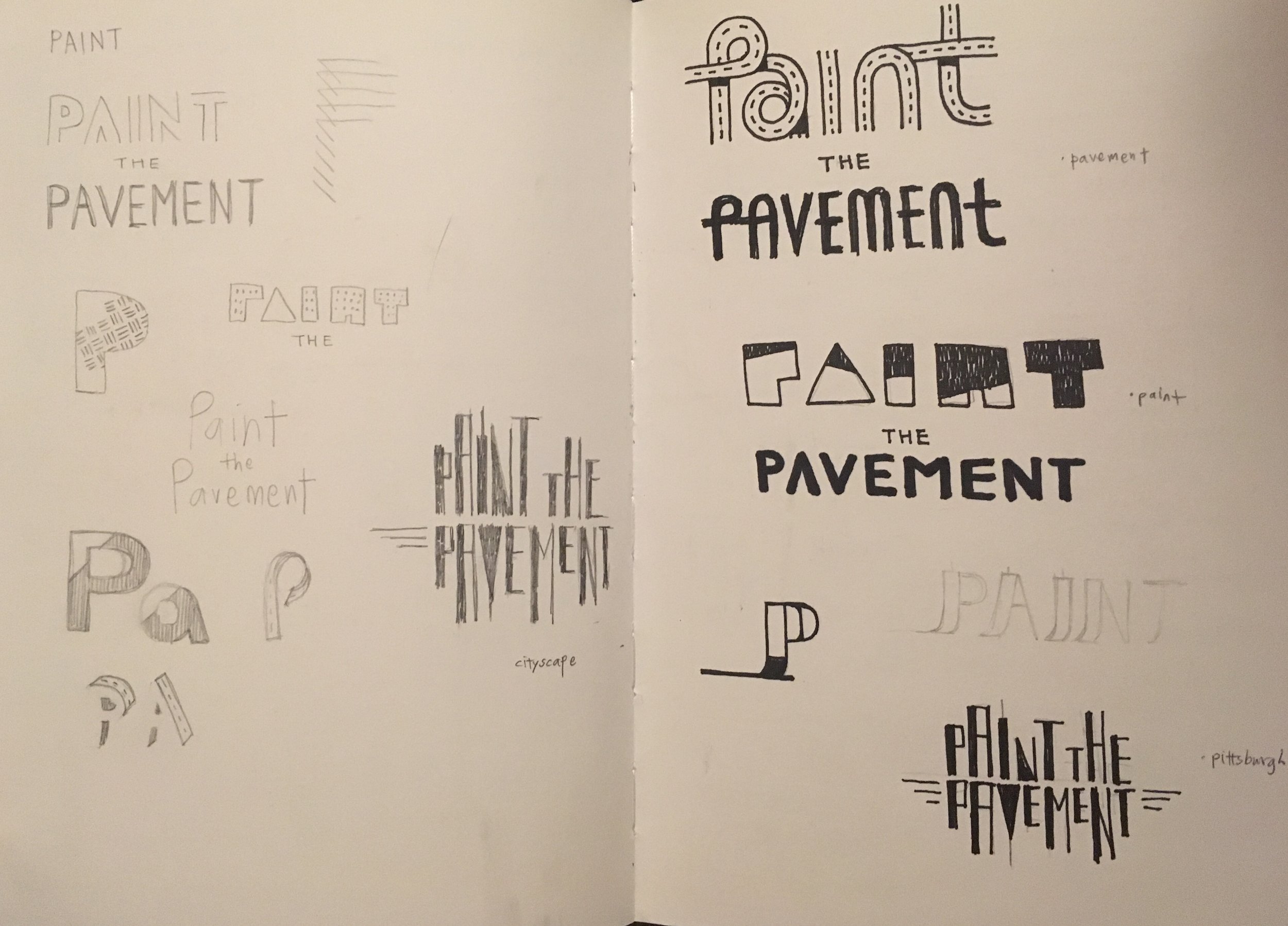
Then, I started iterating on my wordmark, trying to find the form and color that best communicates the voice I wanted it to have. Because my target audience was of younger age group, I wanted it to look and feel rather playful. I sketched out the type with dimensional attributes to accentuate the dynamic and exciting nature of painting. Then, I played with the color with different types of fills. I have tried solid fills and textured ones also, but thought that gradients were more effective in conveying depth and dimensionality.
Meanwhile, I was challenged not to be literal or in other words, not to communicate through pictorial images or graphics. For example, even though Pittsburgh's iconic imagery is a bridge, I had to try to communicate the characteristic without actually placing the vectorized form onto my wordmark.
![]()
![]()
![]()
Meanwhile, I was challenged not to be literal or in other words, not to communicate through pictorial images or graphics. For example, even though Pittsburgh's iconic imagery is a bridge, I had to try to communicate the characteristic without actually placing the vectorized form onto my wordmark.
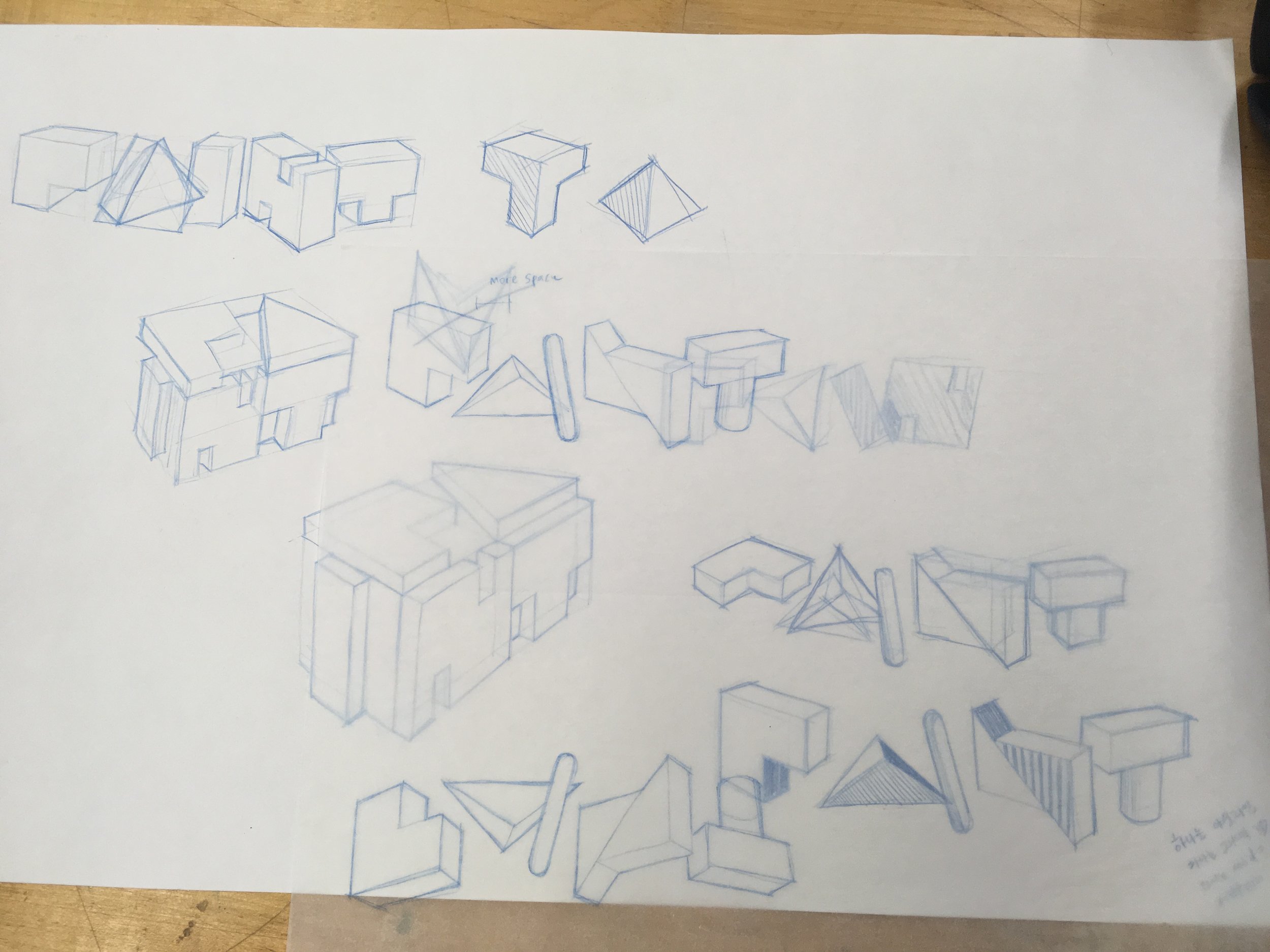
ITERATIONS
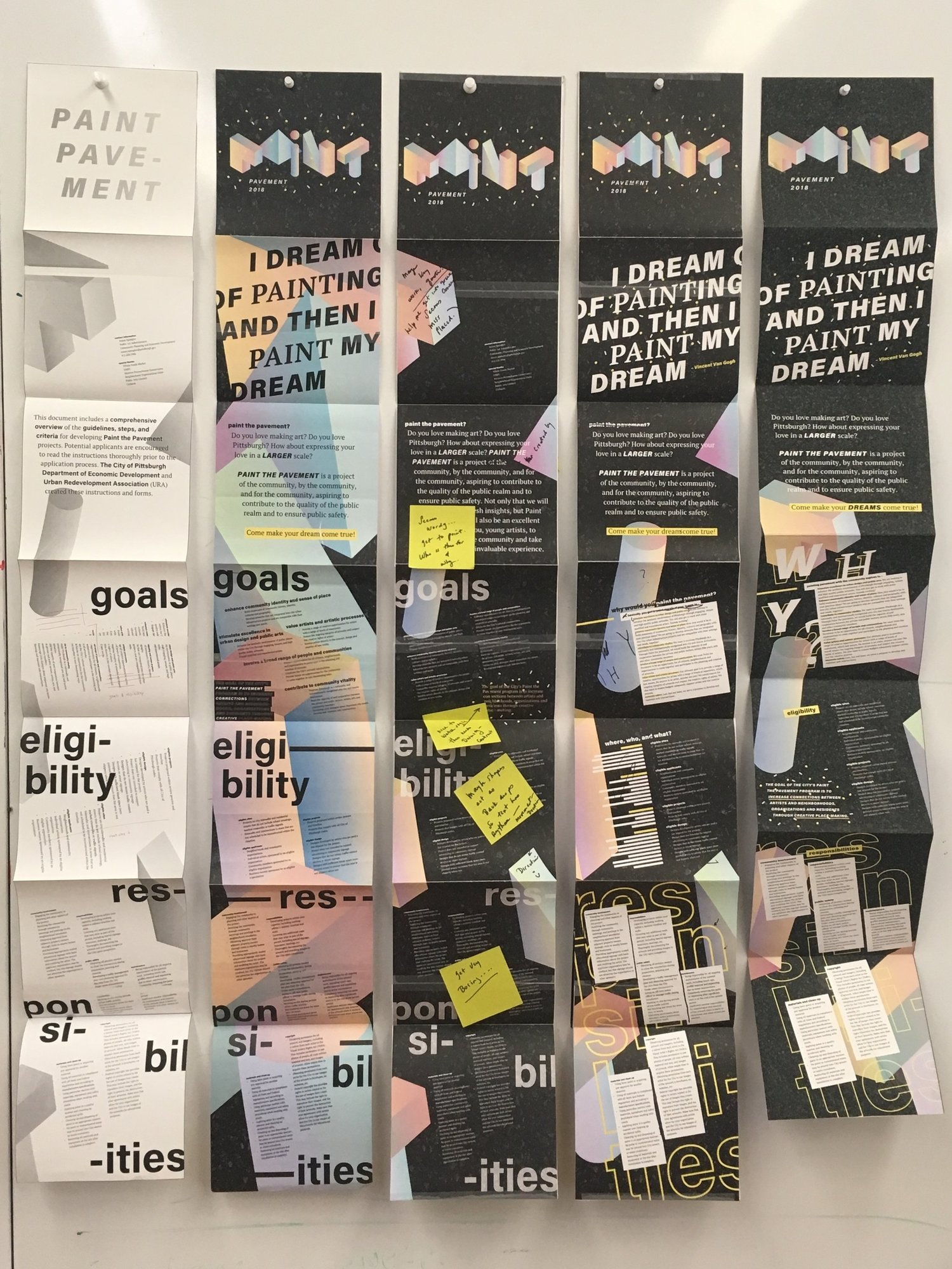
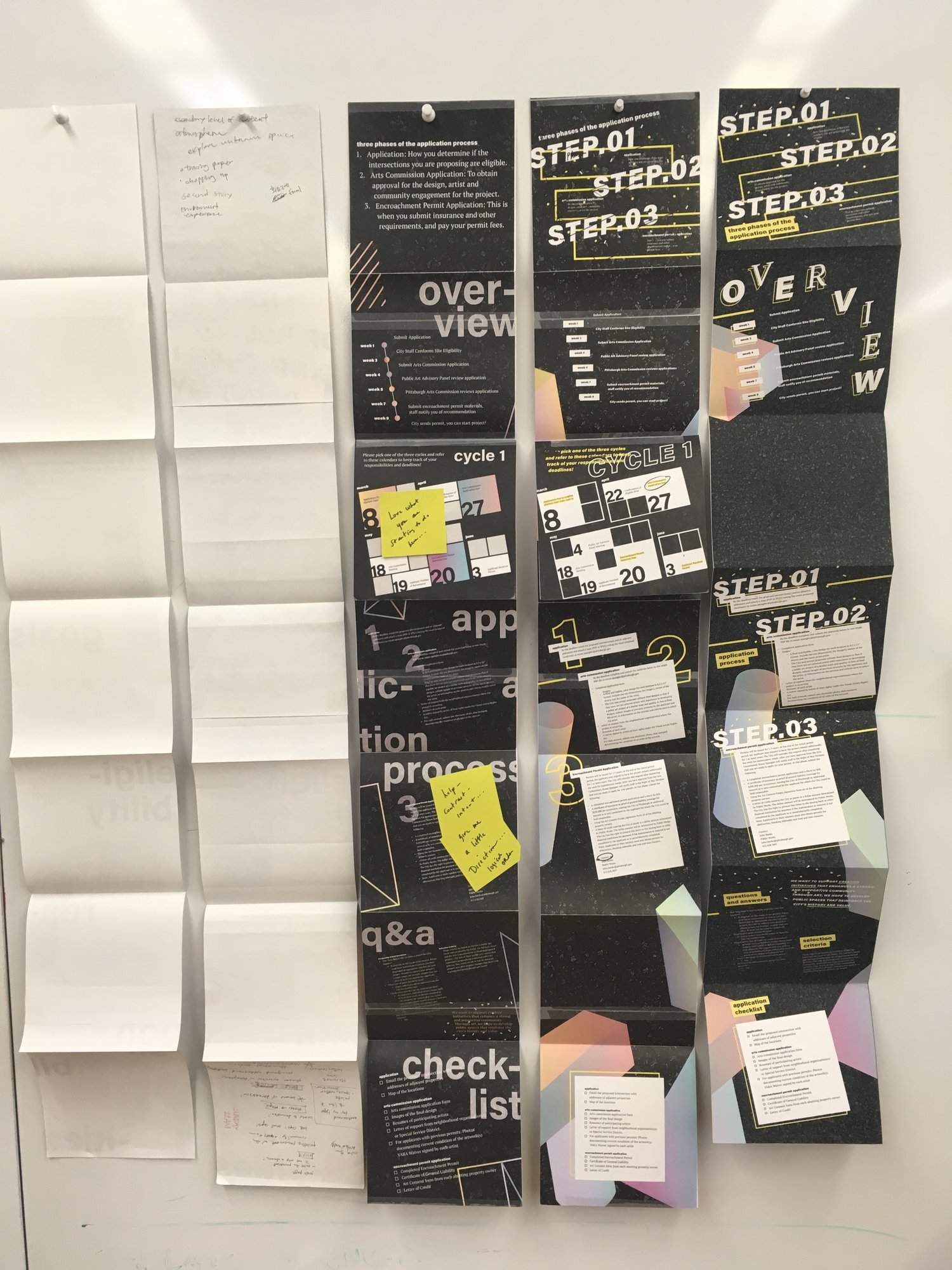
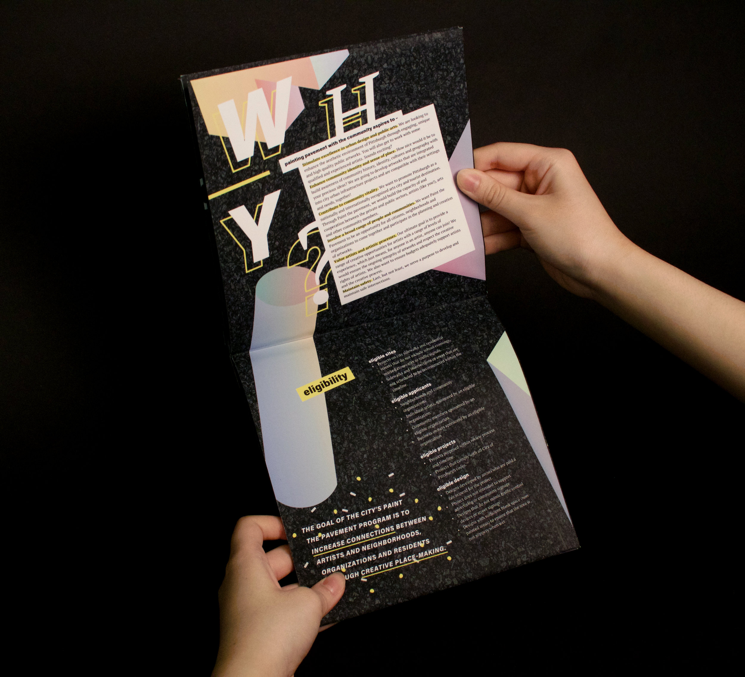
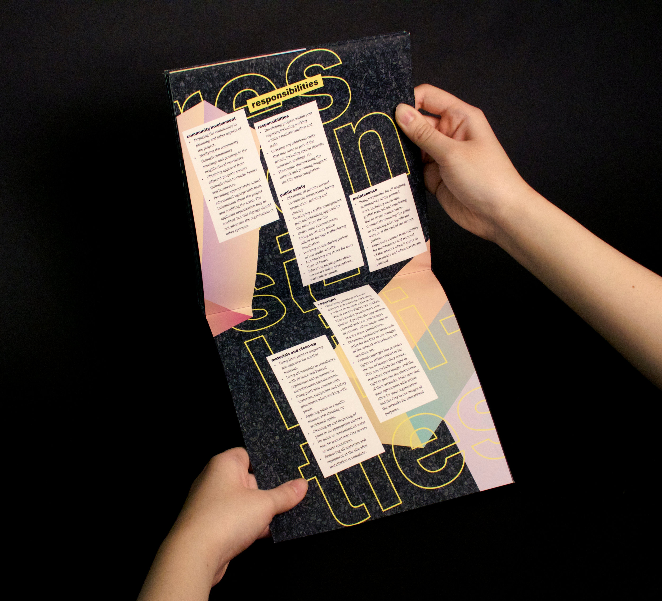
For the overall grid structure of my printed deliverable, I chose a complex grid with many diagonal lines because I thought it would go along with my wordmark since it is not static but suggests active movement. As I proceeded and started placing objects and text on top of my grid, there were instances when I considered switching to a more simple modular grid and starting over. However, I think I learned the most out of it because I did not give up on my decision but worked through it through iterations.
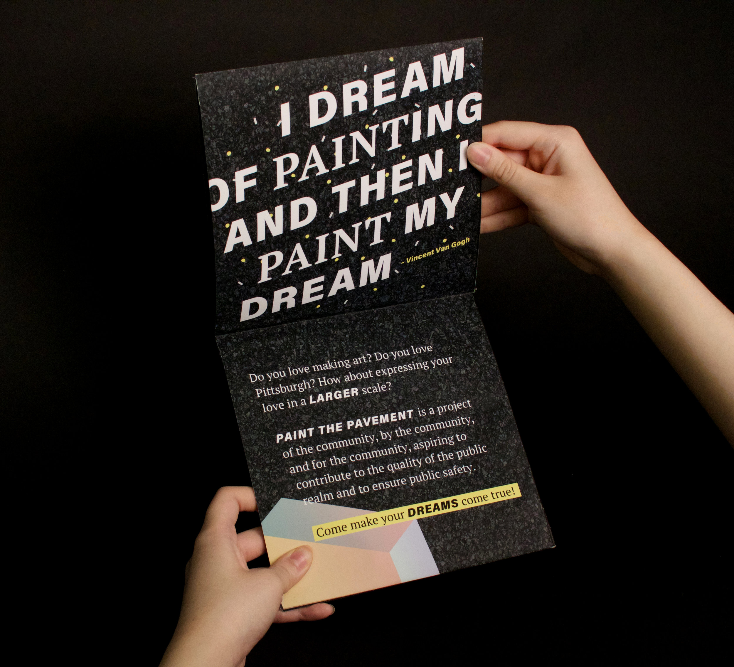
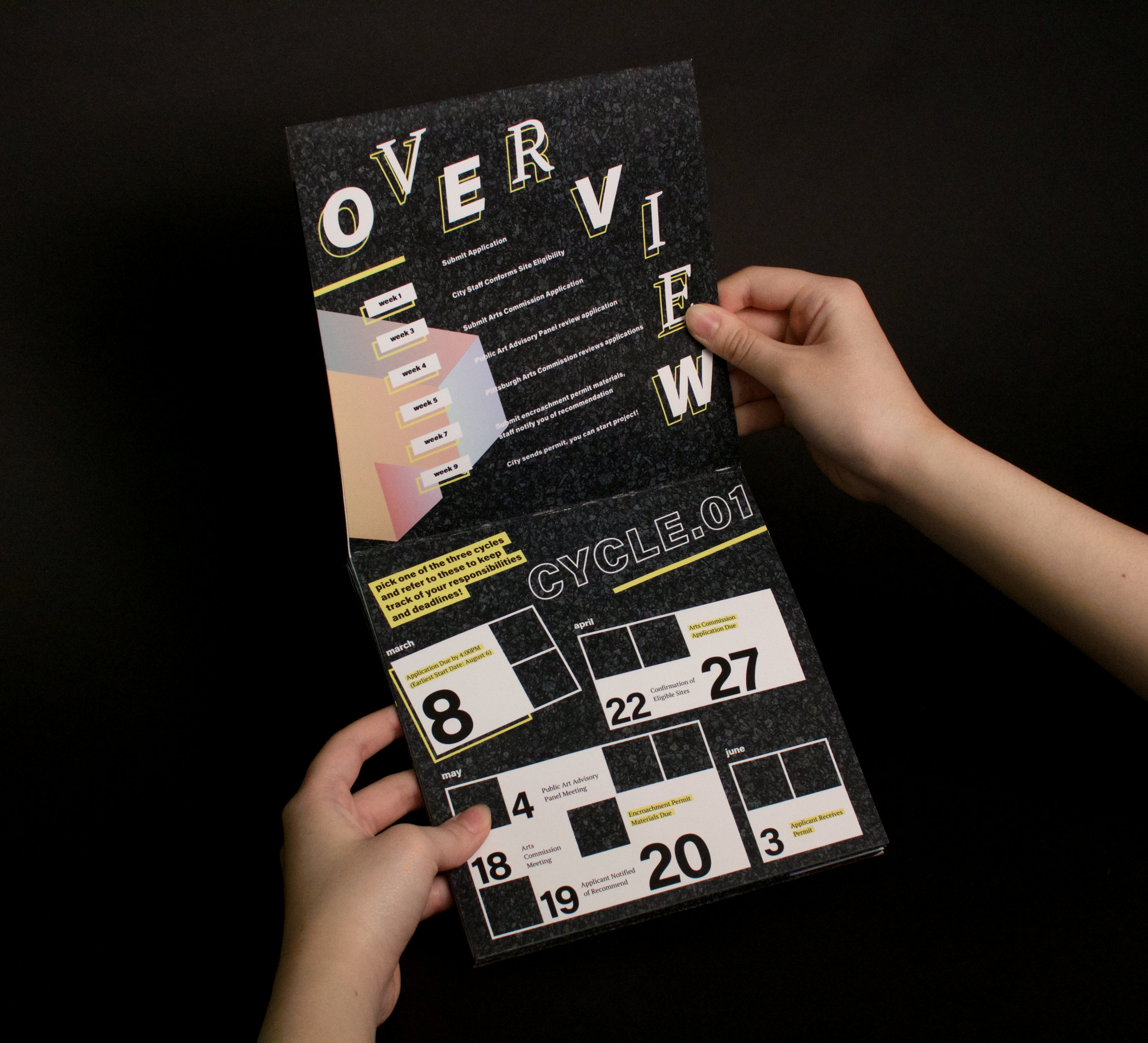
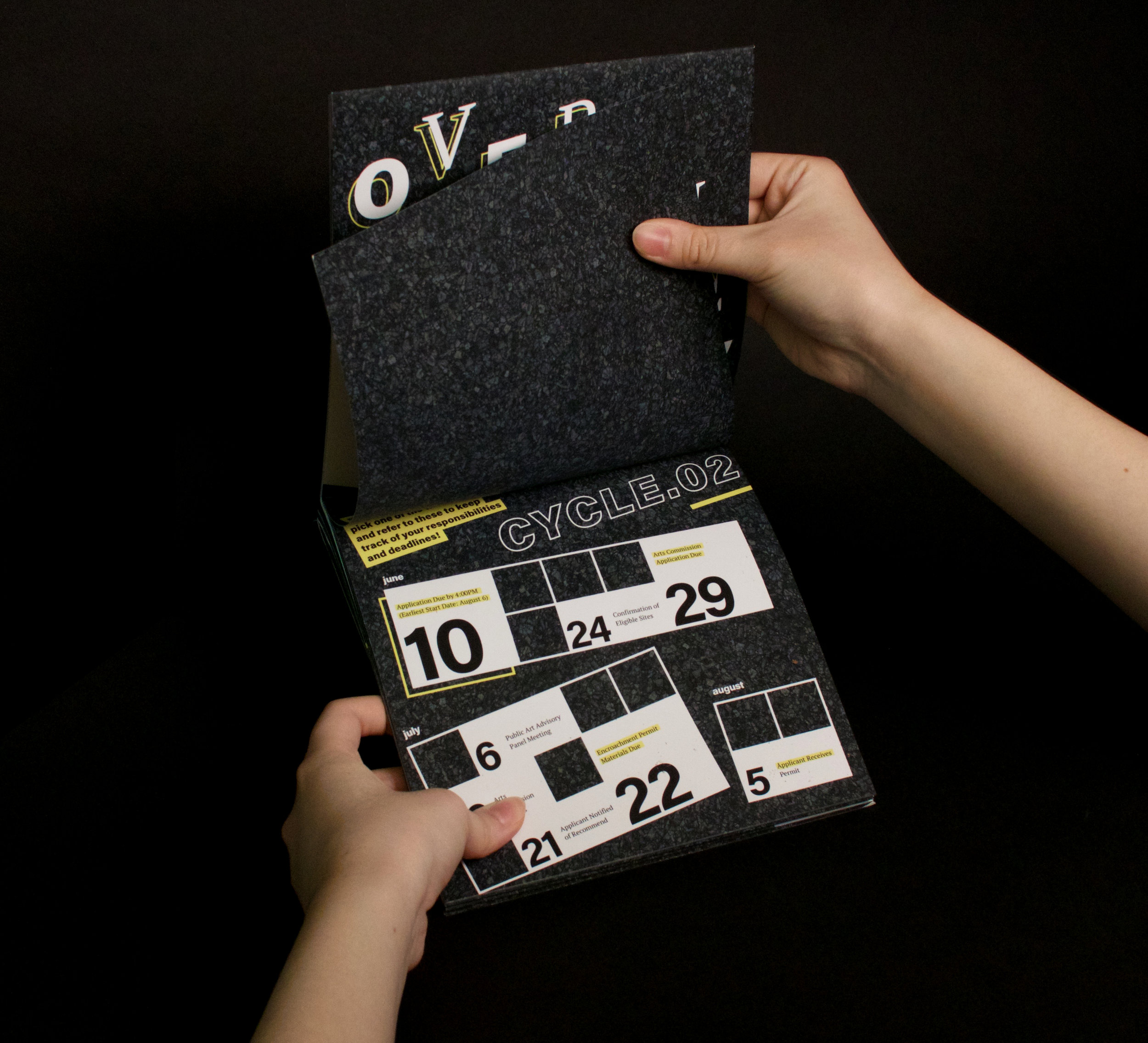
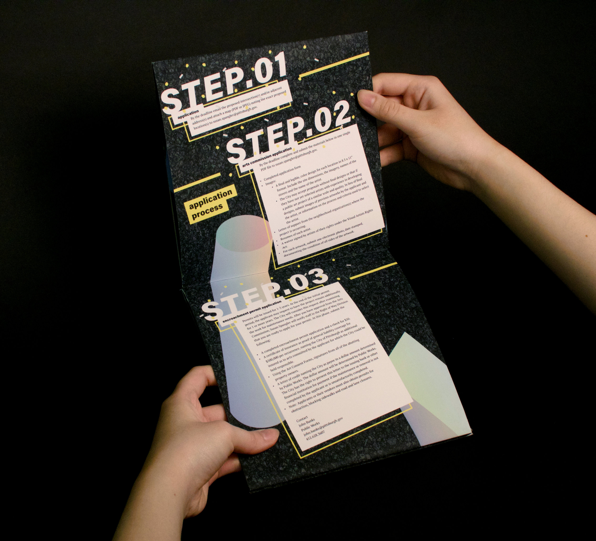
When working on the grid, I also had to decide the dimension of my pamphlet. I chose a stacked alignment of perfect square that would open up vertically because I wanted the user's interaction with the content material to be linear.
The content involves the program's objective, eligibility, responsibilities of the participants, and important information about the application process such as deadlines and requirements. Since the reader should eventually be going over these information thoroughly, I formatted each pages differently so that the reader would not lose attention.
Along with organizing and formatting the content, I added some catch, validation, and call to action through placing inspirational and suggestive messages along with the required text. My tagline for this project was "I dream of painting and then I paint my dream," quoted by Vincent Van Gogh, which I thought suits the intention and would be influential considering my target audience. It also went along well with the dreamy color scheme that I have established.


